In this video, I outline the technique of Step and Repeat, which allows a Photoshop user to automatically repeat a certain action in order to create patterns.
Wednesday, 30 December 2015
Wednesday, 23 December 2015
Audience Profile--Fakebook

Made with: Fakebook and Photoshop.
This is what a typical member of my target audience may have on their Facebook page.
(Open the image in a new tab and zoom in.)
Monday, 21 December 2015
Saturday, 19 December 2015
Album Design
Title: Where My Armour Ends
Artist: In Step
Tracklist:
Artist: In Step
Tracklist:
- Skin
- Our City
- Backwards (Pt. I)
- Backwards (Pt. II)
- Empty Horizons (feat. Sam Tsui)
- Shades Of Grey
- Hurricane
- Bring Me The Night
- Shadows
- No Way
- Out Of Time
- C'mon
- DKLA (Acoustic Cover)
I chose to call the album Where My Armour Ends, because a lot of alternative albums have metaphysical names such as Beneath The Skin, Come Alive and Make A Shadow.
The duo's name is IN STEP, because the two of them are in tune with each other and play music as part of one whole unit.
The album design may include the tracklist faded across the cover.
The album design may include the tracklist faded across the cover.
Thursday, 10 December 2015
Questionnaire
A questionnaire was conducted to gather data on the target audience's expectations of an indie music magazine, and whether they matched up with mine.


Wednesday, 2 December 2015
Sunday, 29 November 2015
Existing Indie Album Covers
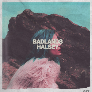 |
| Badlands (Halsey) |
BADLANDS uses a colourised style, which is a little posterised. The BADLANDS text is covering her eyes, which could symbolise how the audience is listening to her description of the 'badlands'--everything wrong with society--through her eyes. The obscuring of the eyes could also represent that she is nobody in comparison to the atrocities of the badlands and that she can't do anything about it.
 |
| Room 93 (Halsey) |
ROOM 93 uses a similar colourised style, using cyan and magenta. The image is small, like looking through a window. It could symbolise Halsey inviting the audience into her world. Her name is prominent on the cover, and the colours are inverted when the text obscures the window to create contrast. The cover is slightly distorted.
 |
| I Of The Storm (Of Monsters And Men) |
This cover is made up of a simple logo on a textured background. The logo is a sharp eye, representing the idea of the 'eye of the storm' referenced in the title. The group's name isn't used on the cover--only the stylised acronym.
Saturday, 28 November 2015
Friday, 27 November 2015
Thursday, 26 November 2015
School Prospectus—Final
This is the final front cover and the contents page for the preliminary task of the school prospectus.
 |
| Cover |
 |
| Contents Page |
I stuck to the draft for the front cover, using a photo of a student holding books, an image with universal academic connotations. On the front cover, I used the following skills:
- Curve adjustment layers and clipping masks to control the brightness of the lights and shadows of individual images
- The Shape tool to create the gold strip
- The Magic Wand selection tool to select the background of the logo and the student and mask it out in order to create transparency
- A mixture of a layer mask, a clipped Fill adjustment layer and the gradient tool to make the text transition between two shades of gold, giving it more depth
For the contents page, I used columns, using different sizes of font for the heading of each article. I changed the blending mode of the St. Mark's logo to Overlay in order to create a three-dimensional background to add more depth. I also used a clipped Hue and Saturation adjustment layer to control the balance of green and red in the main image.
Evaluation
Some of the things which could have been improved about the preliminary task are:
- How the student's hair isn't masked out perfectly. In order to avoid this in the future, the Refine Edges tool could be used to create a more precise mask.
Tuesday, 24 November 2015
Research #6—NME Magazine Double Page Spread

Codes and Conventions
Still Graphics
The left page is completely taken up by a medium shot of the artist. The image is desaturated, but recolourised so that it fits with the colour scheme of orange. The only other image on the spread is the square in the right-hand column, which shows a performance.
Written Language
An important pull quote is placed in the centre of the page, with the surrounding text wrapped around it. Consequently, important words within the quote are emboldened and enlargened. Drop capitals are also used.
Layout
Both pages stick to the rule of thirds:
- The title text on the left page is centered:
- IN spans the middle column
- GOOD goes from the edge of the first column to the beginning of the third
- HEALTH spans the entire page
Research #5—NME Magazine Contents Page

Codes and Conventions
Still Graphics
The main image on the page is one of a featured artists, spanning what would have been two of the thirds on the page. The other image is one of the front cover of the issue, promoting the subscription.
Written Language
The description of the main article is the longest, and typeset in heavier and larger font to emphasise it as the main feature. The language is informal, with brackets and rhetorical questions which sound conversational. Red, black, white and yellow text is used, with yellow used exclusively in the promotion to make it stand out.
Layout
The layout is loosely based on the rule of thirds, with the three visible columns being unevenly spaced. The contents tables are in the first and third, with the main article and promotion in the second.
Research #4—NME Magazine Cover

Codes and Conventions
Still Graphics
The main image on the page is one of Alex Turner from the Arctic Monkeys. He's holding a record, which relates to the topic of their article: "The Record That Changed My Life".
Computer generated graphics include the RECORD STORE DAY 2012 banner, which is stylised to fit with the black, white and red colour scheme. Blue is used elsewhere for emphasis.
Written Language
The NME text is layered behind the model, while the artists' names are in front. This creates a sense of depth to the image. Every other name is emboldened.
The colour scheme used is red, light blue and white.
The Record That Changed My Life is in a brushlike font, perhaps connoting creativeness and messiness.
The question at the bottom of the page prompts the reader to think, and may make them more eager to buy the magazine.
Layout
The cover follows the basic layout conventions. It is split into thirds, with the model taking up the middle third, and the font in the left third is the biggest, as that would be the side which would be on display on a magazine rack in the shop. The layer with the masthead is behind the one with the model.
Monday, 23 November 2015
School Prospectus—Draft
Using stock images from the internet and photos from the school website, I put together this draft version of the school prospectus preliminary task:


In the design, I used the school colours, burgundy and gold, as a house-style. I included the school logo, and used a medium shot of a student as the main focus of the image. Any secondary images which I include will have a white border to make them stand out on the page, and any text will be white.
Preliminary Task Images
These are the images which I ended up taking for the preliminary task:
 |
| 1 |
 |
| 2 |
 |
| 3 |
 |
| 4 |
 |
| 5 |
 |
| 6 |
 |
| 7 |
 |
| 8 |
 |
| 9 |
 |
| 10 |
 |
| 11 |
 |
| 12 |
 |
| 13 |
 |
| 14 |
For the preliminary task, I chose to use images 2, 6, 8, 11, 13 and 14.
I chose 2 because of its use of space, 6 because of its simplicity, 11 because it was the most level angle out of the three shots I took. 13 shows the school's logo, while 14, the shot of the books, shows the academic side of the school as well as the vocational side of the music.
Thursday, 19 November 2015
Research #3—Q Magazine Double Page Spread
 |
| A double page spread from the October 2010 issue of Q magazine. |
Codes and Conventions
Still Graphics
The left hand page is taken up by a close-up of the featured artist, Jay-Z. The image is colourised: red on the left half, a lighter blue on the right.
The Q logo, as usual, is in the bottom left corner of the right hand page.
Written Language
In the bottom left, the issue number and date are displayed.
A pull quote is used on the left hand page, as well as a short caption.
Each section is begun by a serif drop cap.
Layered over the text is a large red J, to indicate Jay-Z.
Layout
The right hand page is split into two columns, which is conventional for a magazine article.
Tuesday, 17 November 2015
Research #2 — Q Magazine Contents Page
Research continued with the analysis of the contents page of a 2008 issue of Q magazine.
Still Graphics
The single image of The Courteeners dominates the page, taking up the top two thirds of the centre and right-hand thirds. This displays them as the primary focus of this issue of the magazine—or, at least, a prominent feature.
In the Review panel, Nick Cave takes up a single ninth of the page, as the secondary focus.
Written Language
In the top right, the issue number and date are displayed.
Down the left-hand third, the articles in the magazine are listed, followed by a short description of the feature. There are thirteen of them in this issue.
The Every Month section displays the usual features of the magazine, such as the crossword.
Layout
The page adheres to the rule of thirds reasonably well:

What can I use from this?
 |
| The contents page of the Oct. 2008 issue of Q magazine |
Codes and Conventions
Still Graphics
The single image of The Courteeners dominates the page, taking up the top two thirds of the centre and right-hand thirds. This displays them as the primary focus of this issue of the magazine—or, at least, a prominent feature.
In the Review panel, Nick Cave takes up a single ninth of the page, as the secondary focus.
Written Language
In the top right, the issue number and date are displayed.
Down the left-hand third, the articles in the magazine are listed, followed by a short description of the feature. There are thirteen of them in this issue.
The Every Month section displays the usual features of the magazine, such as the crossword.
Layout
The page adheres to the rule of thirds reasonably well:

What can I use from this?
I can implement the article preview/summary feature in my own magazine, and use a main image of another act besides the one which the double page spread is focused on.
Wednesday, 11 November 2015
Photoshop Practice — Nature Magazine
Today was spent practising Photoshop skills. I took photos in order to make the cover of a nature magazine, and practised using Photoshop to manipulate these images.
I chose these images in order to evoke an autumnal feel, with the red, gold and orange of the leaves and the brown of the ducks.
During the editing process, I used:
 |
| The first image which was chosen. I liked it because of the use of space and perspective. |
 |
| The second image which was chosen. In this image, there is one lone white duck, which I thought would catch someone's eye if they were to look at the image. |
 |
| The third image which was chosen. This shot has an autumnal theme, with the blanket of leaves on the ground. |
 |
| The editing process |
- Shapes to create borders and boxes for the text
- Curves, adjustment layers and clipping masks to change the brightness of the lights and shadows in each image
- Hue and saturation adjustment layers to make the background image seem more autumnal than it was in real life (on the day on which the photos were taken, it was overcast)
 |
| The final cover |
If I were to redesign the cover, I would add some kind of effect to the header text to make it not as two-dimensional—perhaps a glow, drop shadow or bevel.
Tuesday, 3 November 2015
Research #1—Q Magazine Cover
Research began with the analysis of the cover of a music magazine. The magazine which was chosen was a 2008 issue of Q magazine, which is a magazine which focuses on indie music. The purpose of analysing magazine covers was to pinpoint their conventions and to identify techniques which could potentially be implemented in my own music magazine.
Still Graphics
The Q magazine logo is displayed prominently in the top left corner, as this is the place where most people first look when reading a magazine. The logo itself is simple: a white capitalised Q on a red background. Because it is so simple, it is easily recognisable.
The two featured artists, Mark Ronson and Ricky Wilson, take up most of the cover. The shot is a medium shot, which is used to show the two men's body language and clothing. Studying their proxemics reveals that the two are close to each other, which could hint at the intimacy of their interview in the magazine. They also have direct eye contact with the camera.
In the top right corner, there is a small banner of The Ting Tings, another group which is featured in the magazine.
Written Language
The colour scheme used for the typography is a metallic gold and white. The gold indicates sophistication and rarity, while the white is used for contrast against the white background.
Several different font weights are used on the cover: the heaviest for the word "DUETS", the medium weight for the names of the other artists featured in the issue on the right hand side ("MADNESS", "THE ZUTONS"), and the lightest for the subtitles. Font weight is generally used to draw the audience's attention to certain aspects of the cover.
Superimposed on the Q logo is a sticker-like graphic, proclaiming that the issue is a "196-page bumper issue" in a heavy font weight. This is a promotional move which encourages the customer to buy the magazine, as it has more content than usual.
Layout
The cover has a subtle three-column layout, which may not be immediately noticeable, as some of the text on the cover spans two of the columns. The main text spans the left two columns, and information such as the secondary articles take up the right third.
What can I use from this?
When I create my own magazine cover, I will ensure that my model has direct eye contact with the camera in order to create an intimate mood. I will also use the rule of thirds for the layout, with the magazine's logo in the top left and the masthead occupying the rest of the top third.
 |
| The August 2008 issue of Q Magazine (http://i28.tinypic.com/314v90g.jpg) |
 |
| Becky and myself analysing the cover |
 |
| The TAPE analysis |
Codes and Conventions
Still Graphics
The Q magazine logo is displayed prominently in the top left corner, as this is the place where most people first look when reading a magazine. The logo itself is simple: a white capitalised Q on a red background. Because it is so simple, it is easily recognisable.
The two featured artists, Mark Ronson and Ricky Wilson, take up most of the cover. The shot is a medium shot, which is used to show the two men's body language and clothing. Studying their proxemics reveals that the two are close to each other, which could hint at the intimacy of their interview in the magazine. They also have direct eye contact with the camera.
In the top right corner, there is a small banner of The Ting Tings, another group which is featured in the magazine.
Written Language
The colour scheme used for the typography is a metallic gold and white. The gold indicates sophistication and rarity, while the white is used for contrast against the white background.
Several different font weights are used on the cover: the heaviest for the word "DUETS", the medium weight for the names of the other artists featured in the issue on the right hand side ("MADNESS", "THE ZUTONS"), and the lightest for the subtitles. Font weight is generally used to draw the audience's attention to certain aspects of the cover.
Superimposed on the Q logo is a sticker-like graphic, proclaiming that the issue is a "196-page bumper issue" in a heavy font weight. This is a promotional move which encourages the customer to buy the magazine, as it has more content than usual.
Layout
The cover has a subtle three-column layout, which may not be immediately noticeable, as some of the text on the cover spans two of the columns. The main text spans the left two columns, and information such as the secondary articles take up the right third.
 |
| The rule of thirds, as demonstrated by this cover |
What can I use from this?
When I create my own magazine cover, I will ensure that my model has direct eye contact with the camera in order to create an intimate mood. I will also use the rule of thirds for the layout, with the magazine's logo in the top left and the masthead occupying the rest of the top third.
Saturday, 31 October 2015
On Choosing A Genre (Video)
Transcript
For me to be able to start researching music magazines, I need to first decide on the genre of music that I'm going to be focusing my own magazine on. I had to think long and hard about which genre to choose—it had to be a genre which would let me be creative design-wise but also one I enjoy and one I would be able to write comfortably about for the double-page spread.
I've chosen to focus on some of the different sub-genres of indie music.
I'm going to quickly outline some of the artists which I could potentially be using as a reference style-wise as I create my magazine. I've picked one female artist, one male artist and one group.
The first artist is Halsey, a female electropop artist. I’ll play a little of one of her songs for you now: 'Ghost', from her 2015 album 'BADLANDS'.
'Ghost' Music Video (1:37—2:10)
I really love the colour schemes Halsey uses in her promotional videos and music videos. She uses a lot of neon lights and contrasting colours which are pleasing to the eye. It’s this vibrancy which I’d love to emulate in my magazine.The second artist I've chosen is Troye Sivan, an Australian artist who also produces electropop. This is 'FOOLS', from his 2015 EP 'WILD'.
'FOOLS' Lyric Video (0:31—0:52)
'FOOLS' Music Video (1:46—2:08)
Troye uses softer pastel colours, especially in his lyric videos. His music videos generally have lots of camera movement and blurring, giving everything a dreamlike atmosphere.
The final group I've chosen is an Icelandic indie folk band, Of Monsters And Men. This is 'King And Lionheart', from their 2011 album 'My Head Is An Animal'.
'King And Lionheart' Music Video (0:30—1:15)
Most of the music videos Of Monsters And Men produce use the same kind of animated style, with a theme of sparks and fire—quite different to Halsey and Troye. It’s a lot darker and grittier. However, this could be another potential direction for the magazine to go in—and something I’d be equally as happy to explore.In the coming days, I will be researching different magazines from this genre, so I can see the different conventions that each one uses, and how to implement those in my own magazine. This will allow me to start designing and creating concepts for the magazine. Afterwards, I can start planning and designing photo-shoots in order to gain the necessary material which I’ll need to create my magazine’s cover, contents page and double-page spread.
Software used: Audacity, Hitfilm 3 Express, HandBrake
Wednesday, 21 October 2015
The Task
To create a front cover, contents page and double page spread for a new music magazine, using all original images and text.
- Research and Planning—20 marks
- Construction—60 marks
- Evaluation—20 marks
Subscribe to:
Comments (Atom)