In this video, I outline the technique of Step and Repeat, which allows a Photoshop user to automatically repeat a certain action in order to create patterns.
Wednesday, 30 December 2015
Wednesday, 23 December 2015
Audience Profile--Fakebook

Made with: Fakebook and Photoshop.
This is what a typical member of my target audience may have on their Facebook page.
(Open the image in a new tab and zoom in.)
Monday, 21 December 2015
Saturday, 19 December 2015
Album Design
Title: Where My Armour Ends
Artist: In Step
Tracklist:
Artist: In Step
Tracklist:
- Skin
- Our City
- Backwards (Pt. I)
- Backwards (Pt. II)
- Empty Horizons (feat. Sam Tsui)
- Shades Of Grey
- Hurricane
- Bring Me The Night
- Shadows
- No Way
- Out Of Time
- C'mon
- DKLA (Acoustic Cover)
I chose to call the album Where My Armour Ends, because a lot of alternative albums have metaphysical names such as Beneath The Skin, Come Alive and Make A Shadow.
The duo's name is IN STEP, because the two of them are in tune with each other and play music as part of one whole unit.
The album design may include the tracklist faded across the cover.
The album design may include the tracklist faded across the cover.
Thursday, 10 December 2015
Questionnaire
A questionnaire was conducted to gather data on the target audience's expectations of an indie music magazine, and whether they matched up with mine.


Wednesday, 2 December 2015
Sunday, 29 November 2015
Existing Indie Album Covers
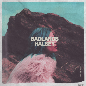 |
| Badlands (Halsey) |
BADLANDS uses a colourised style, which is a little posterised. The BADLANDS text is covering her eyes, which could symbolise how the audience is listening to her description of the 'badlands'--everything wrong with society--through her eyes. The obscuring of the eyes could also represent that she is nobody in comparison to the atrocities of the badlands and that she can't do anything about it.
 |
| Room 93 (Halsey) |
ROOM 93 uses a similar colourised style, using cyan and magenta. The image is small, like looking through a window. It could symbolise Halsey inviting the audience into her world. Her name is prominent on the cover, and the colours are inverted when the text obscures the window to create contrast. The cover is slightly distorted.
 |
| I Of The Storm (Of Monsters And Men) |
This cover is made up of a simple logo on a textured background. The logo is a sharp eye, representing the idea of the 'eye of the storm' referenced in the title. The group's name isn't used on the cover--only the stylised acronym.
Subscribe to:
Posts (Atom)